Voci, an enterprise AI company specializing in real-time voice analytics, had a dated website that failed to communicate the sophistication of its technology. Visitors bounced quickly, and the brand lacked credibility in a competitive AI market.
The main challenge: distill complex machine learning capabilities into a clear, engaging narrative that could build trust with technical and business buyers alike.
My Role: Lead UX/UI Designer | Branding | Strategy
The team: Jack Maden + Alvaro Ruiz + Ignacio Polanco + Marian Castaneda
Tools: Figma, Adobe Creative Suite and AI-assisted content exploration

The previous website struggled to communicate Voci’s cutting-edge solutions. The navigation was cluttered, making it difficult for users to find product details. Analytics revealed a 63% bounce rate and an average time on page of only 32 seconds, indicating low engagement. The site wasn’t driving conversions, and potential customers weren’t staying long enough to explore Voci’s offerings.


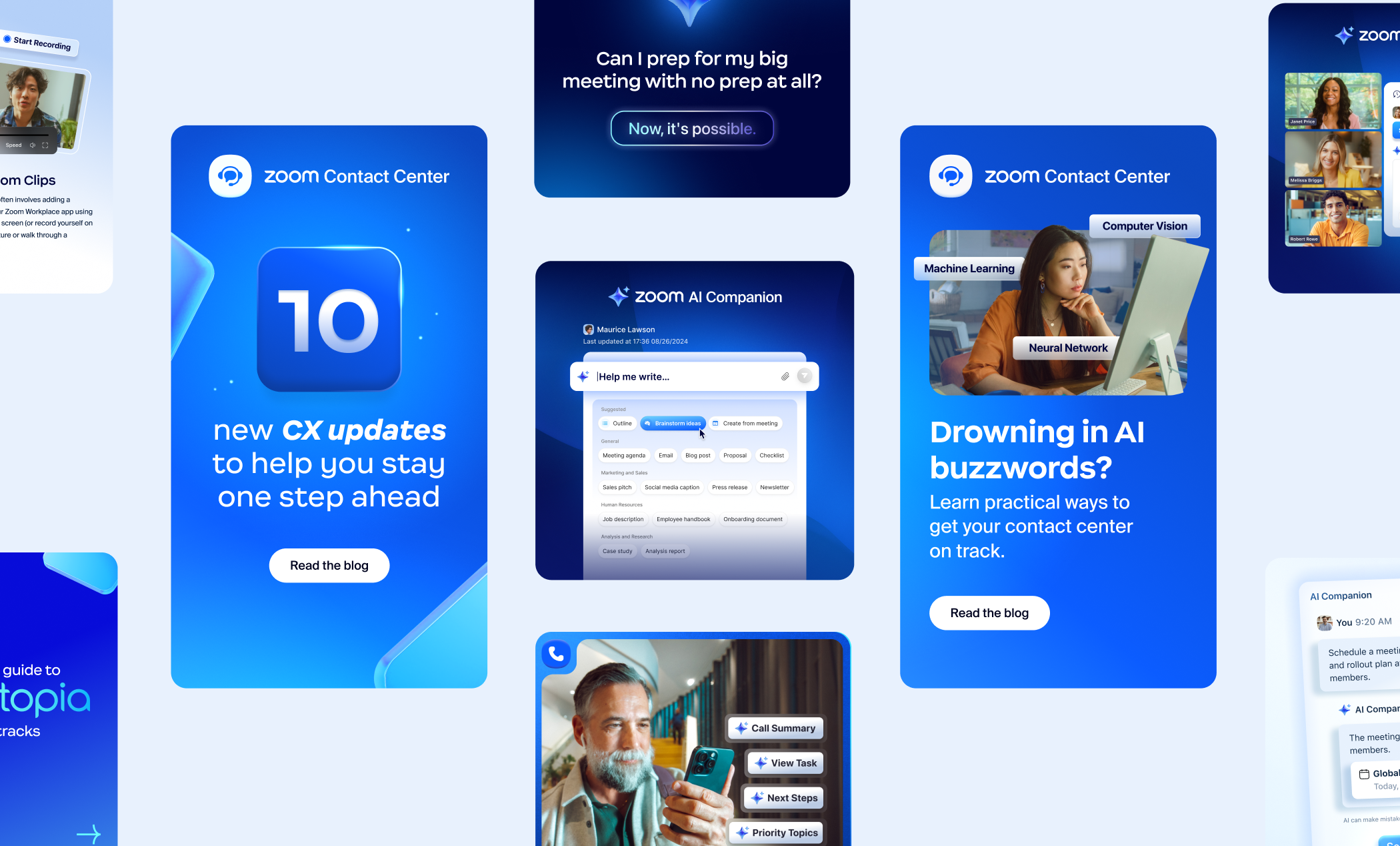
To address these issues, we restructured the site’s information architecture, simplifying the navigation from seven to four main categories. Visually, we introduced a modernized UI with an updated color palette, typography, and custom iconography that made complex ideas more digestible. Stronger calls-to-action were implemented to guide users toward demo requests and product exploration. I collaborated closely with developers, building a scalable design system that ensured consistency across the site and maintained accessibility best practices.
The redesign led to immediate improvements: bounce rate dropped to 42%, time on page increased to 1 minute and 45 seconds, and lead conversions rose by 28%. These results reflect a more effective user journey and stronger engagement. The new website also helped position Voci as a leader in AI-driven voice analytics, with a visual identity that matched the sophistication of its technology.