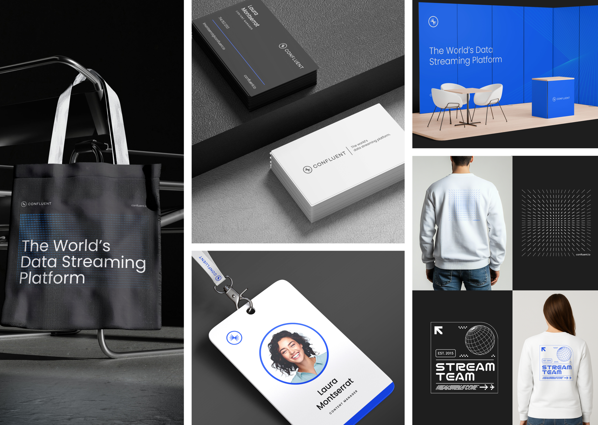
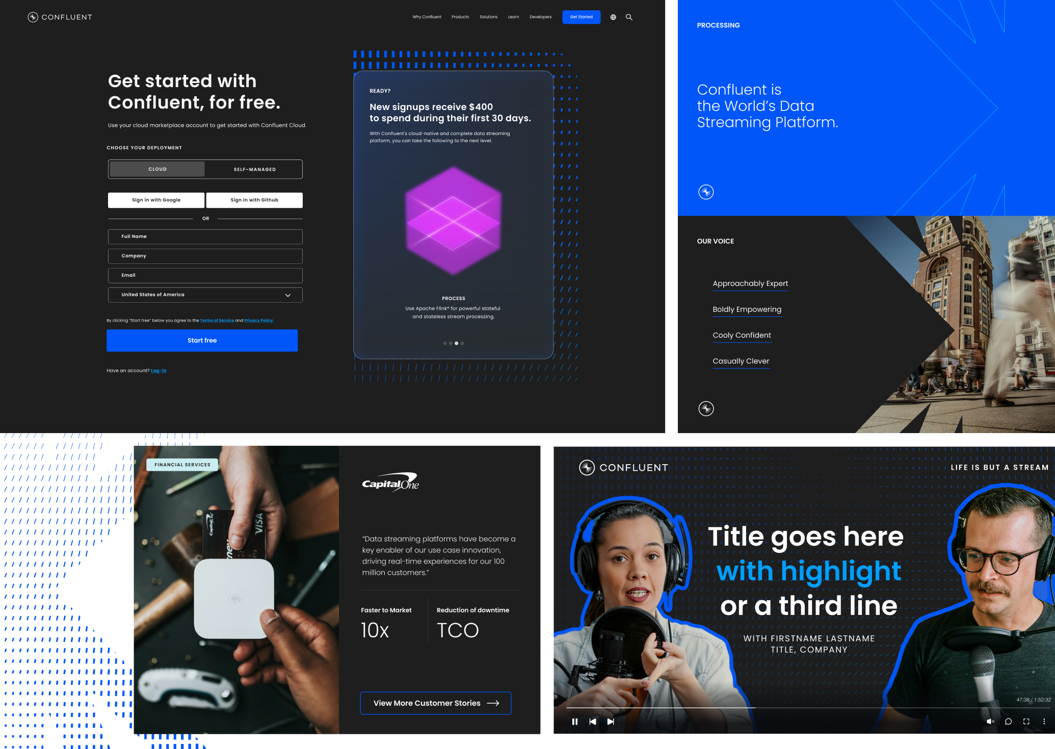
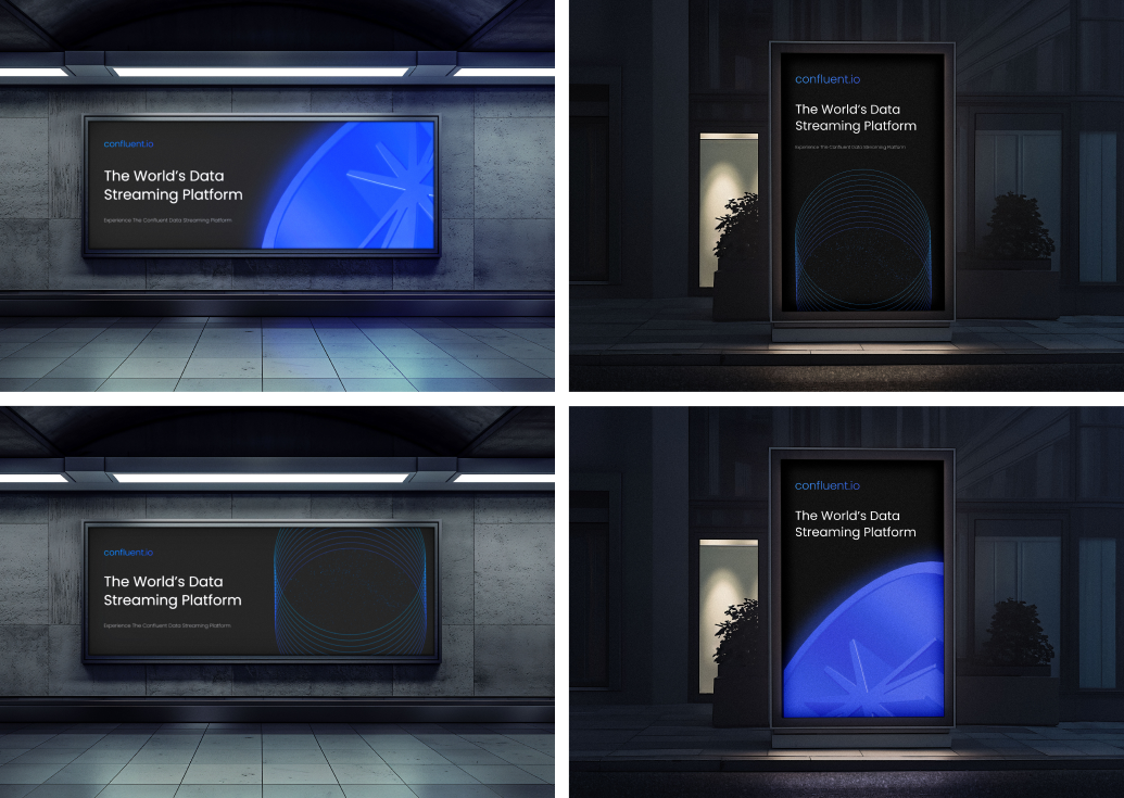
This project focused on translating Confluent’s brand into a motion system that could carry both clarity and momentum. Built around the idea of real-time data in motion, the work explores how a structured visual language, rooted in pattern, typography, and color, can scale across product, marketing, and brand moments while still feeling dynamic and alive.
The team: George Barros, Nick Bizzack, Delaney Pratt- Fitzgerald, Lisa Varrall, Ashley Locke, Thera Conrad, Kelly Carlquist, Adam Peterson, Adam Vaughan, Jesse Holden
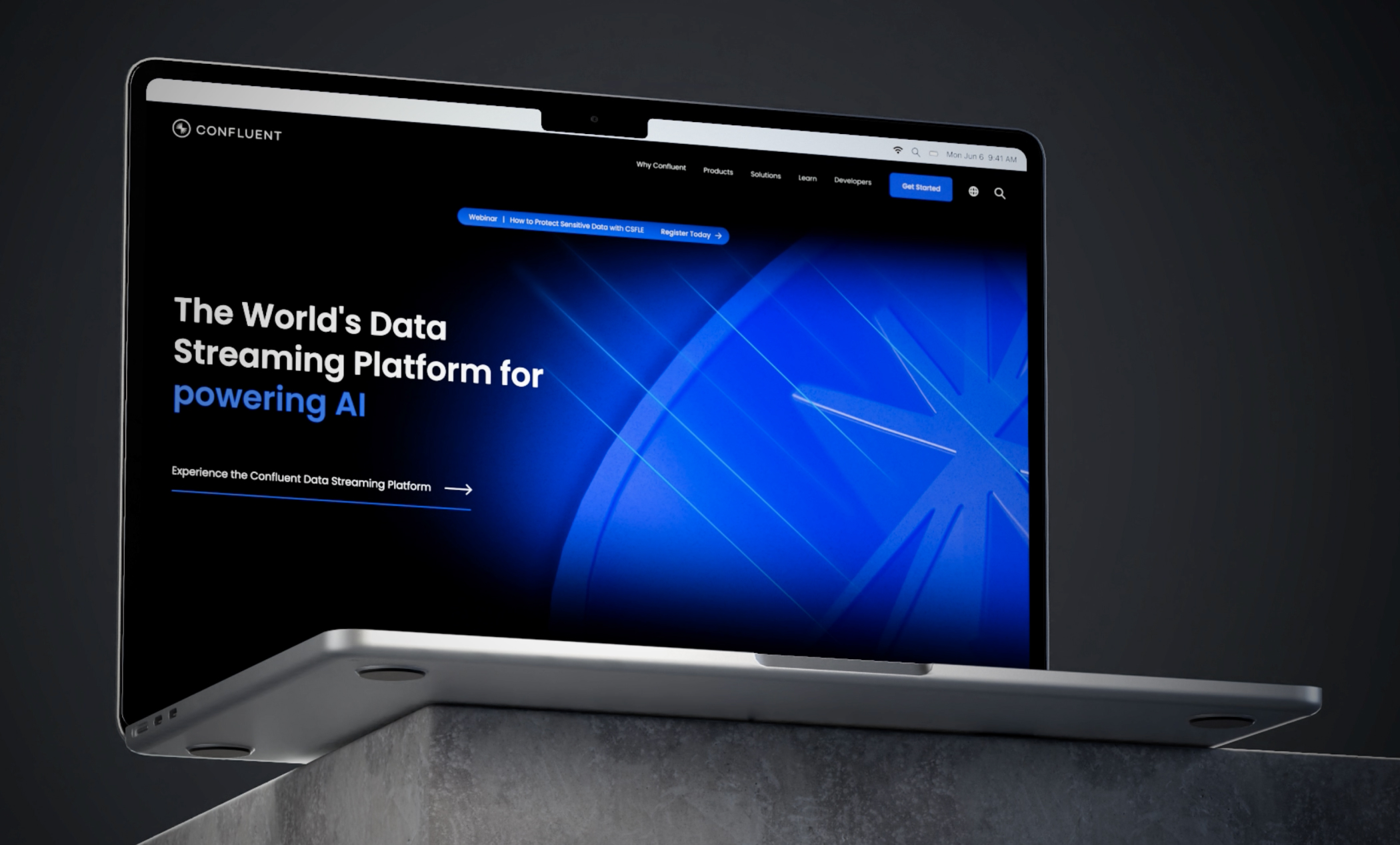
Confluent operates in a highly technical space, but the brand needed to feel approachable, not abstract or inaccessible. The challenge was to express complex ideas like real-time data, flow, and connectivity in a way that felt clear and intuitive, while staying true to the brand’s core idea: instant is everything
At the same time, the system had to remain flexible. It needed to work across a wide range of touchpoints, from product-driven visuals to more expressive storytelling, without losing consistency or impact.

The system is built around a core geometric language derived from the burst and its underlying structure. From this, a set of modular patterns [Data Streams, Connections, Motion, and Universe] create a flexible foundation that visually represents flow, direction, and scale
Color is used with intention. Neu Blue anchors the identity, paired with high-contrast dark and light backgrounds to maintain clarity and hierarchy, while gradients and secondary tones add depth without overpowering the system
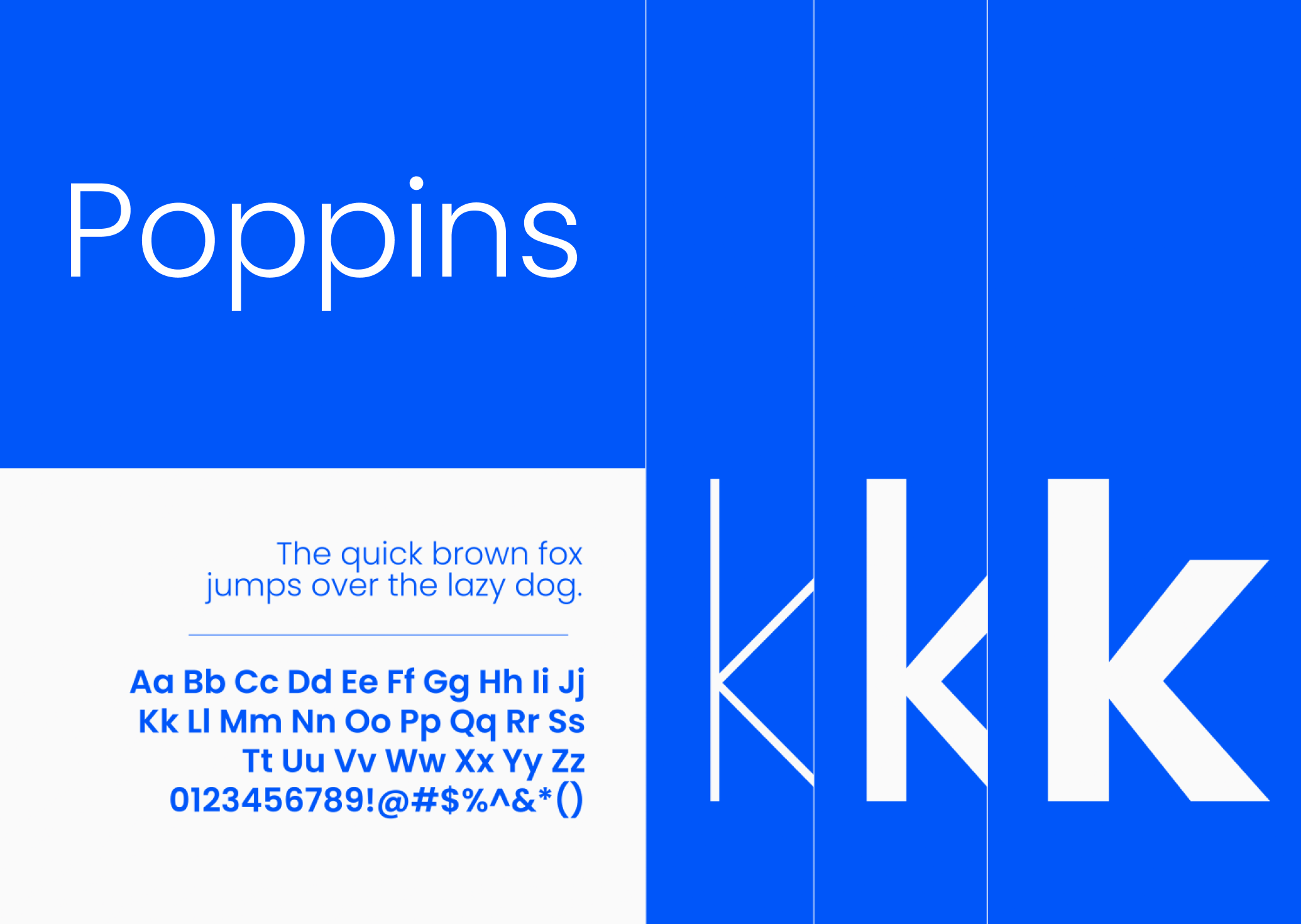
Typography, set in Poppins, provides a clean and confident baseline, balancing expressiveness with legibility across all applications
Motion is where everything comes together. Patterns animate with a sense of flow and continuity, reinforcing the idea of data moving in real time. The result is a system that feels cohesive, scalable, and aligned with the brand’s role as a leader in data streaming, clear in structure, but never static.